A conversion is only the final signal
Leasing teams naturally pay attention to outcomes: inquiries, scheduled tours, applications, and signed leases.
Those numbers matter, but they do not explain what happened before the action—or why another prospect left without taking it.
Between the first property view and the final conversion, people make a series of smaller decisions. They choose whether to continue, which building to open, which floor plan to compare, whether a tour answers their questions, and whether the next step feels relevant.
The digital journey contains signals at each of those moments.
Analytics becomes useful when it connects them into a story. Instead of asking only how many people converted, teams can begin asking where interest became stronger, where it weakened, and what information may have been missing.
The goal is not to collect more numbers. It is to see where the experience stops supporting the renter’s next decision.
Begin with the path, not the dashboard
A dashboard can display dozens of metrics and still leave a team unsure what to change.
The better starting point is the renter’s path.
What are the key stages of the experience? Which transitions indicate growing intent? Where does the journey ask the user to make a choice?
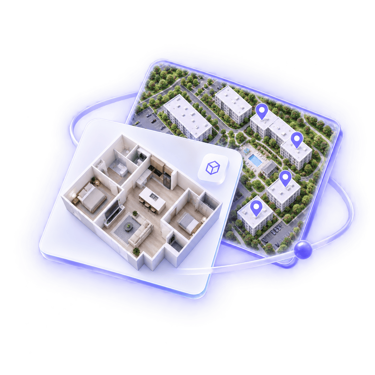
For a connected property experience, that path might move from an overview to a map, from the map to a building, from a building to a floor plan, and from a floor plan to a residence or tour. The exact sequence can vary, but each step represents a question the renter is trying to answer.
Metrics should help evaluate those transitions.
This makes the data easier to act on. A number is no longer isolated; it belongs to a specific point in the experience and a specific decision the team can investigate.
Entry points show expectation
Where a prospect begins can shape everything that follows.
Someone arriving from a property homepage may be exploring broadly. Someone opening a specific floor plan from a listing may already have a more focused question. A visitor coming from a campaign about amenities may expect to reach that content immediately.
Entry-point data helps teams understand the expectation each audience brings into the experience.
Useful signals include:
A high exit rate at an entry point does not always mean the content is weak. It may indicate a mismatch between what was promised and what appeared first.
If the source creates a specific expectation, the landing experience should confirm it quickly.
Depth shows whether curiosity grows
Time on page alone can be misleading.
A long session may indicate meaningful exploration, or it may indicate that someone cannot find what they need. A short session may reflect low interest, or a prospect who reached the right information immediately.
Depth provides more context.
How many meaningful parts of the property did the visitor explore? Did they move from a broad view into a building, amenity, floor plan, or residence? Did they compare options or return to a previous one?
These actions suggest active evaluation rather than passive viewing.
The most useful definition of depth depends on the experience. Opening ten images is not automatically stronger engagement than viewing one floor plan and then selecting a matching residence. The quality of the sequence matters more than the raw count.
Teams should identify the interactions that represent genuine progress and distinguish them from repeated clicks that do not move the renter forward.
Transitions reveal friction
The space between two steps is often more informative than either step alone.
Many prospects may view a floor plan, but how many continue to a residence? Many may open the map, but do they reach a building or amenity? Many may enter a tour, but do they return to the broader property experience afterward?
Transition rates show where interest carries forward and where it breaks.
A weak transition can have several causes:
The metric identifies the location of the problem, not necessarily the reason. That is why it should be paired with a review of the actual experience.
When the team knows which transition is underperforming, the design question becomes much more specific.
Repeated behavior can signal uncertainty
Returning to content is not always a sign of strong interest.
A prospect may revisit a floor plan because they are seriously comparing it. They may also return because the first view did not make the layout clear.
Repeated actions need context.
Look at what happens before and after the return. Does the visitor compare another residence, open supporting media, or move toward availability? Or do they loop between the same two views and eventually leave?
Healthy comparison usually expands the journey. Confusion often creates repetition without progress.
This distinction can help teams identify content that attracts attention but does not resolve the renter’s question. A layout may need clearer labels. A residence may need a stronger connection to its location. An amenity may need better media or a more direct route to related units.
The value is not in labeling every repeat visit as positive or negative. It is in understanding the pattern around it.
Search and filters expose priorities
What renters choose to filter for can be as valuable as what they ultimately open.
Bedroom count, floor, view, price range, availability, building, and proximity to amenities all reflect priorities. When certain filters appear frequently, they show which distinctions matter most to the audience.
Filter behavior can also reveal gaps.
If many renters apply a criterion but few results remain, the issue may be inventory. If results exist but users rarely open them, the presentation may not make the differences clear. If a common preference is not supported by a filter at all, prospects may be forced to investigate it manually.
Teams can use these patterns to improve both the interface and the way the property is presented.
The goal is not to add a control for every possible preference. It is to make the most important decisions easier to express and easier to answer.
Exits need context
An exit is not automatically a failure.
A renter may leave after finding a phone number, opening an external application, or getting exactly the information they needed. Another may leave because the experience became unclear or the relevant option was missing.
To interpret exits, look at where they occur and what happened immediately before them.
An exit after a clear conversion action is different from an exit after a dead end. An exit from a completed tour is different from one that occurs in the first few seconds. An exit after viewing unavailable options may point to an inventory or expectation problem rather than a design issue.
Useful analysis connects the exit to the state of the journey.
This prevents teams from treating every drop-off as the same problem and helps them focus on the moments where the experience can realistically improve.
Conversion paths show what supports action
Once someone takes a meaningful next step, the earlier journey can provide valuable context.
Which property elements did converting prospects view? Did they use the map, compare floor plans, open a tour, or return to a specific residence? Which sequences appeared repeatedly before an inquiry or scheduled visit?
These patterns do not prove that a single feature caused the conversion. Leasing decisions are shaped by many factors beyond the digital experience.
But they can show which content and connections consistently support progress.
The team can then strengthen those paths: make useful transitions easier to find, bring high-value content forward, or ensure that campaigns lead into the parts of the experience most relevant to their message.
Analytics should guide attention, not replace judgment.
Turn insight into a focused change
The most useful analysis ends with a testable design question.
Instead of “engagement is low,” the team might identify that prospects open the property map but rarely select a building. Instead of “people leave the floor plan page,” they might see that users compare layouts but do not reach available residences.
Each observation suggests a narrower response.
The team can clarify a label, strengthen a connection, change the order of information, improve a visual asset, or introduce a more relevant next step. Then it can watch whether the specific transition improves.
This creates a practical cycle:
Small, informed improvements are often more valuable than a broad redesign based on a vague performance number.
The takeaway
The most revealing leasing metrics are not isolated totals. They are the signals that explain how interest moves through the property experience.
Entry points show expectation. Exploration depth shows whether curiosity grows. Transitions reveal friction. Repeated behavior, filters, and exits add context. Conversion paths show which connections tend to support action.
Together, these signals help teams see where prospects stop finding what they need.
That is the real value of analytics: not simply reporting what happened, but helping the team make the next renter’s journey clearer, more connected, and easier to continue.